CIRCUIT TOOLS DRIVER ANALYSIS SOFTWARE - macOS
Circuit Tools for Apple Devices - macOS
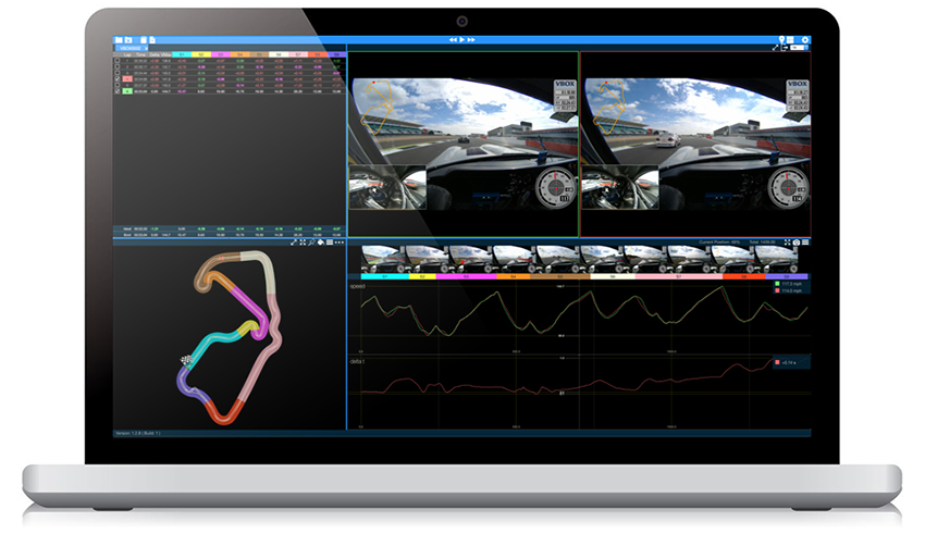
Circuit Tools macOS is very powerful analysis software that allows you to examine your track performance on your MacBook or iMac (operating on macOS 10.12 and higher). Analysis of every brake or turn-in point is easily achieved using the simple yet dynamic interface.


Lap Times
Your Fastest Lap number is highlighted automatically in Green, whilst the fastest times from each section are shown at the base of the table indicating your ‘Ideal’ lap time.

Graph Data
The graph allows channel data for the selected laps to be compared. A coloured bar at the top of the graph shows where each split is in relation to the graph data.

Video
A video for the selected laps are shown. The faster lap has a Green border.

Map
The Map pane shows both the circuit layout and the line taken in the selected laps. In the macOS version each split is designated a colour making it easier to reference the data within the graph.

